Logo use
The primary IDT Corporation logo comes in three orientations: horizontal, vertical, and icon, which can be used interchangeably as needed for the layout.
Text use
Always use IDT word in all uppercase for all brand related graphic, marketing and UI works
Correct use: ✅ IDT Corporation
Incorrect use: ❌ Idt corporation
Incorrect use: ❌ idt corporation
Incorrect use of logo

🚫 Do not scale disproportionately

🚫 Do not skew

🚫 Do not change
the logotype

🚫 Do not use the logo without a black background

🚫 Do not modify the colors

🚫 Do not rotate the logo in any way

🚫 Do not modify the proportions

🚫 Do not use the logo without the text
IDT Corporation colors
Small disclaimer: if you’re looking for our design systems in Figma, you can click here for the IDT Design system (flutter) and IDT Web Design System files.
Main colors for IDT Corporation
Primary color
Neutral color
Neutral color
IDT Corporation primary color set
[Primary 6] is the main color
Success color set
[Success 6] is the main color
Neutral color set
This is for the content, UI design and all sorts of presentation purposes.
Attention color set
[Info 6] is the main color
Warning color set
[Warning 6] is the main color
Error color set
[Error 6] is the main color
Attention color set
[Attention 6] is the main color
Typography
We use IDT Sans font for all of our marketing materials, graphic and UI works. Click here to go to the google drive for the font family folder.
Font use
When using the IDT Sans font, please refrain from using the black and extrablack fonts, they’re to be used when the font size is enormous and for rare cases.

Normal

Medium

Demibold

Bold

Extrabold

❌ Black

❌ Extrablack
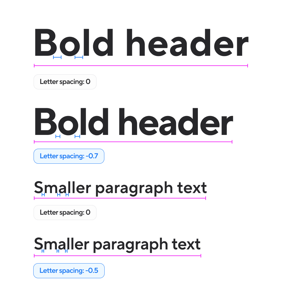
Spacing
Make sure that the font has negative letter spacing for better readability
Bigger your font size, bigger the negative letter spacing