


At zendit all we care about is readability and usability.
This brand guideline is made to give you a feel of our brand.
✨Brand Identity
We want and strive to have our brand to have the following identities:
- Calmness
- Clean and simple
- PLayful and cheerful
- Easy to approach
A small TL;DR
Our product has a developer first approach. So the things we do are naturally aligned with what the general developer population likes.
We try to convey our ideas with the languages that are clear and easy to understand for everyone, and we are supporting this with the help of illustrations and animations.
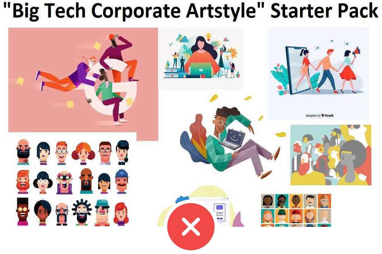
Naturally we don’t use soulless corporate imagery.
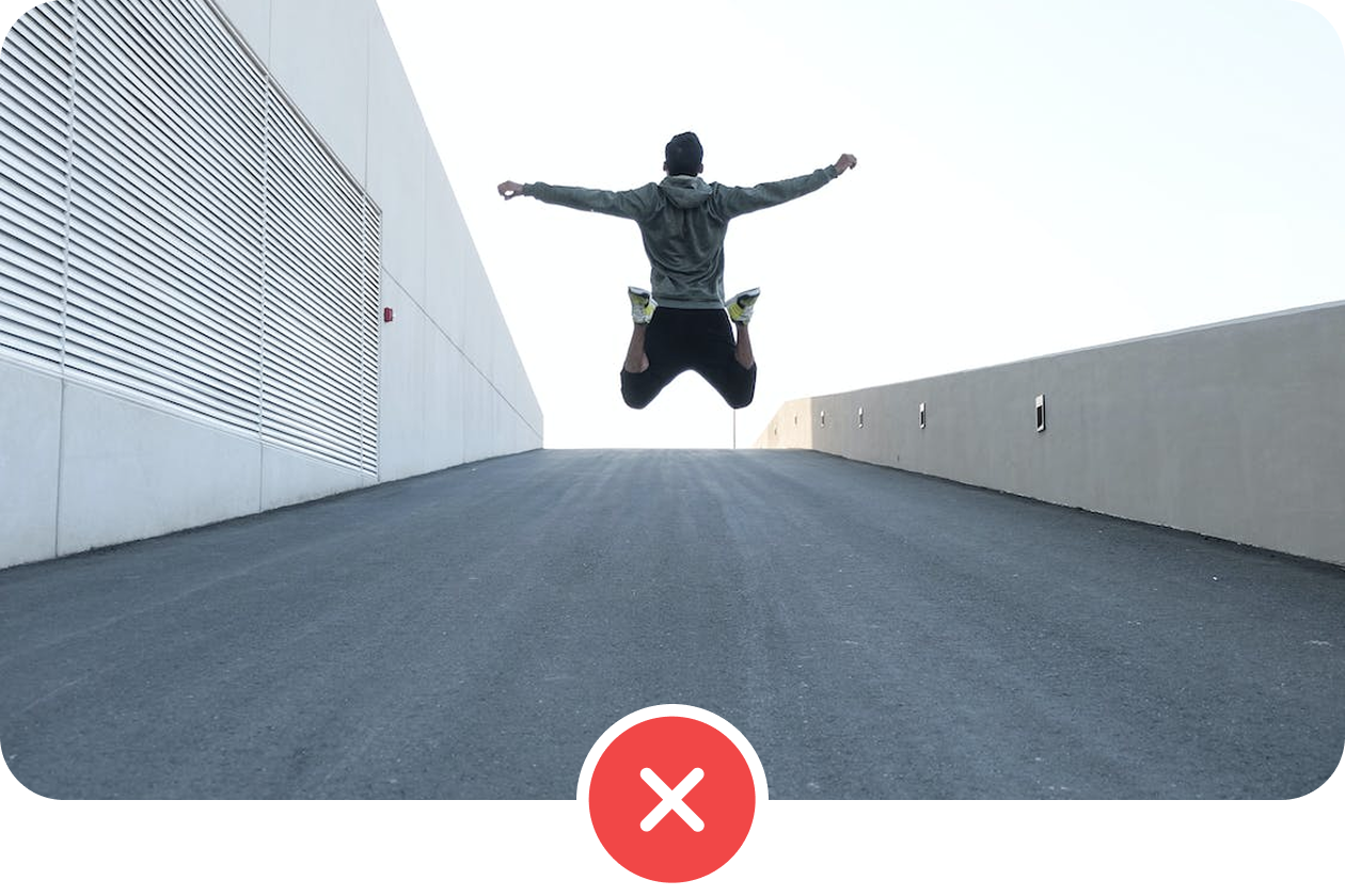
We don’t use stock images that mean nothing. (aka. Stock image abuse)
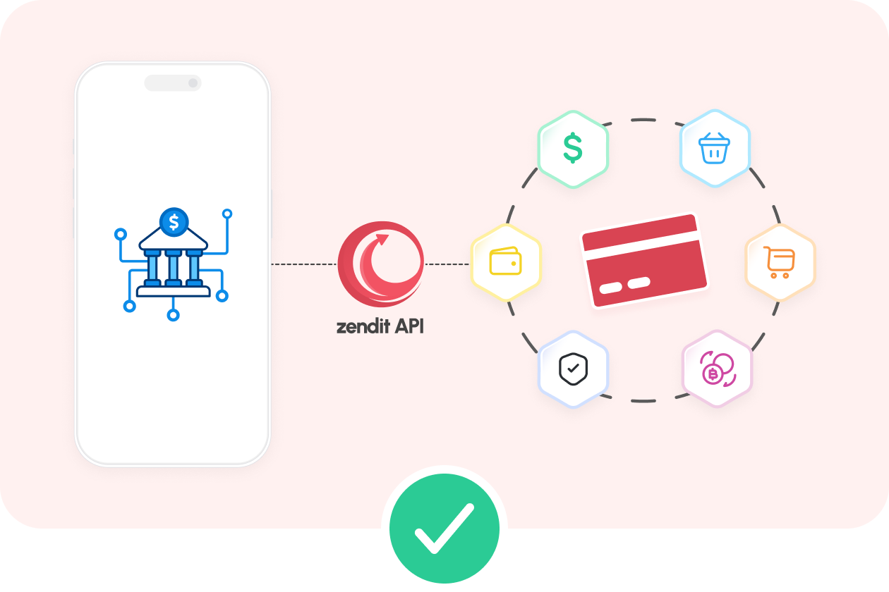
We try and rely on illustrations and animations.
Logo assets and variations
You can use zendit logo with and without the text.
If you don’t want a single logo but all of them in one zip file, click the button below.
Logo
zendit logo follows the icon + text combination
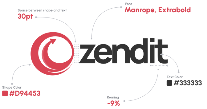
Colored Logo
Simple logo reflects the idea of our focus on main things with nothing distracting. Also it sets the basis of overall brand design — minimalistic style, typography and brand color.
Default Logo
Use on light surfaces
Available downloads: SVG, PNG and JPG
Dark Logo
Use on dark surfaces
Available downloads: SVG, PNG and JPG
Alternative Logo
Completely dark
Available downloads: SVG, PNG and JPG
Alternative Logo
Completely light
Available downloads: SVG, PNG and JPG
Logo without text
Default Logo
Try to use on light surfaces
Available downloads: SVG, PNG and JPG

Dark Logo
Use on dark surfaces
Available downloads: SVG, PNG and JPG

Alternative Logo
Completely dark
Available downloads: SVG, PNG and JPG
Animated logo for loaders

Default Loader
Try to use on light surfaces
Available downloads: SVG and GIF

Grey Loader
Use on very dark surfaces
Available downloads: SVG and GIF

Light Loader
Try to use on dark surfaces
Available downloads: SVG and GIF
Logo Do’s and don’ts
Try to use common sense really.
Pay attention to the contrast and readability. Prioritize using the default logo, especially the zendit icon.
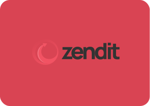
🚫 Mind the contrast for both the icon and the text.
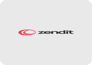
🚫 Pay attention to the logo’s aspect ratio.
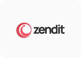
🚫 Do not add shadows to the logo.
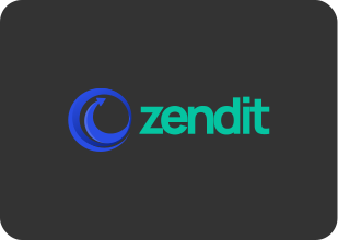
🚫 Do not use a different colors on the zendit logo.
✅ Mind the contrast for both the icon and the text.
✅ Scale the logo with its width and height together.
✅ You can wrap the logo with different shapes.
✅ Stick with the existing zendit logo variations.
Colors
We take our inspiration from the Japanese cherry blossom. (Sakura tree)
Use these colors, combinations and variations to create any presentation you like.
Cherry red
Charcoal
Vanilla
The entire zendit color palette
We have up to 10 versions of each colors to supplement our brand. You can use any of these to create any content you want.
Primary Color Set
Primary-6 is the main color.
Warning Color Set
Warning-6 is the main color. We use it to get the attention of our users.
Success Color Set
Success-6 is the main color. We use it in places where a successful operation is completed.
Error Color Set
Error-6 is the main color. For error displays obviously.
Kate Color Set
Kate-6 is the main color. For various uses on social media, for our lovely colleague Kate
Neutral Color Set for the Light Theme ☀️
This set is used for system elements, typography and reusable blocks across our platforms.
Neutral Color Set for the Dark Theme 🌙
This set is used for system elements, typography and reusable blocks across our platforms.
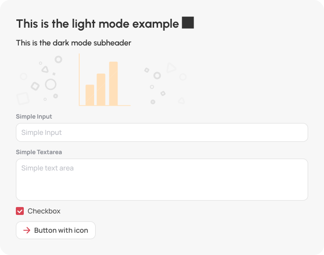
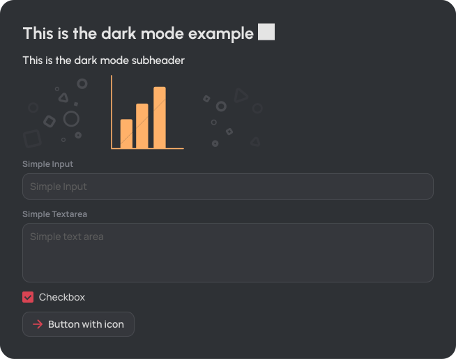
Dark 🌙 and Light ☀️ Mode Example
As long as you stick with the neutral colors everything should fall into place.
Be mindful of the colors and contrast
Typography
Curvy heads, sharp bodies.
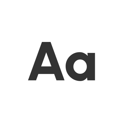
Urbanist
Used for all headers in zendit ecosystem.
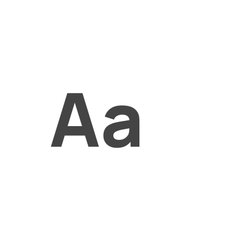
Manrope
Used for all body content in zendit ecosystem.
Desktop vs Mobile
We scale our DISPLAY and HEADER fonts by using REM and also we use different sizing for the mobile devices. Click the button below to see the size changes.
Notice: We do not change the size of our body font. It’s always fixed on all platforms.
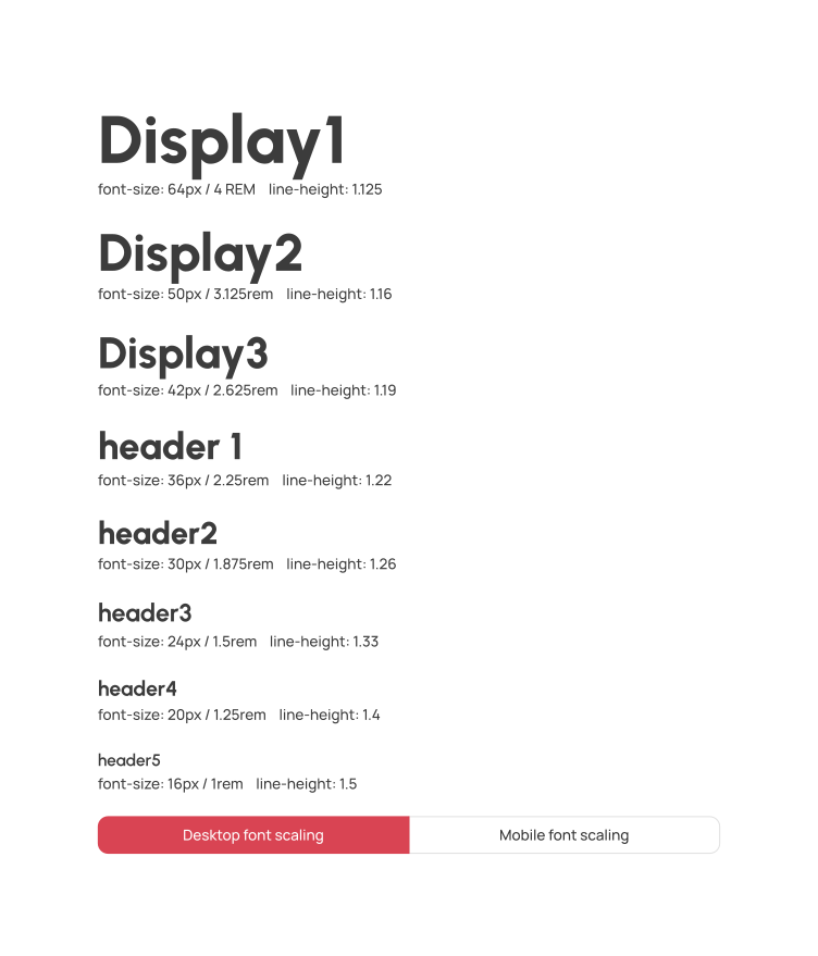
Be mindful of the font size / line height combination

Brand Vibes
Energetic, clean and bold.
As long as materials you prepare are clean and easy to read, you can do whatever you want
- Stick to the brand’s colors. Do not use pastel or faded stuff.
- Use only Urbanist. font.
- Try not to use stock images.

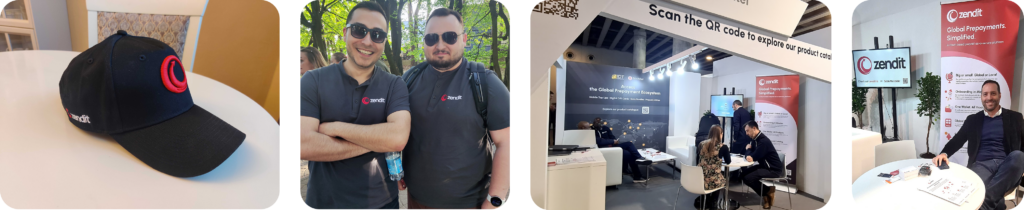
Social media examples

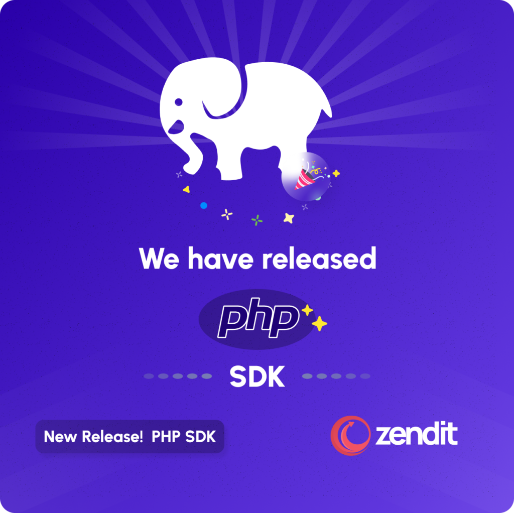
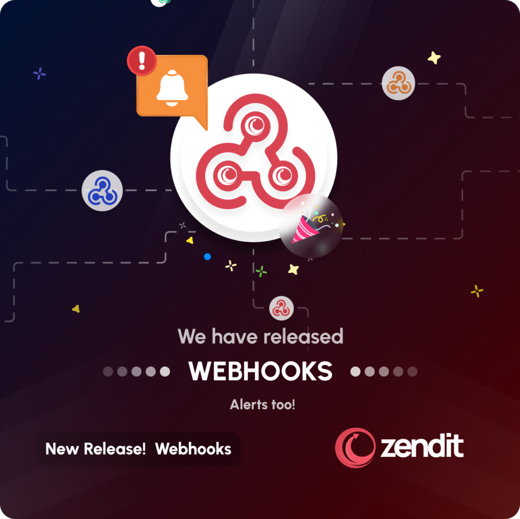
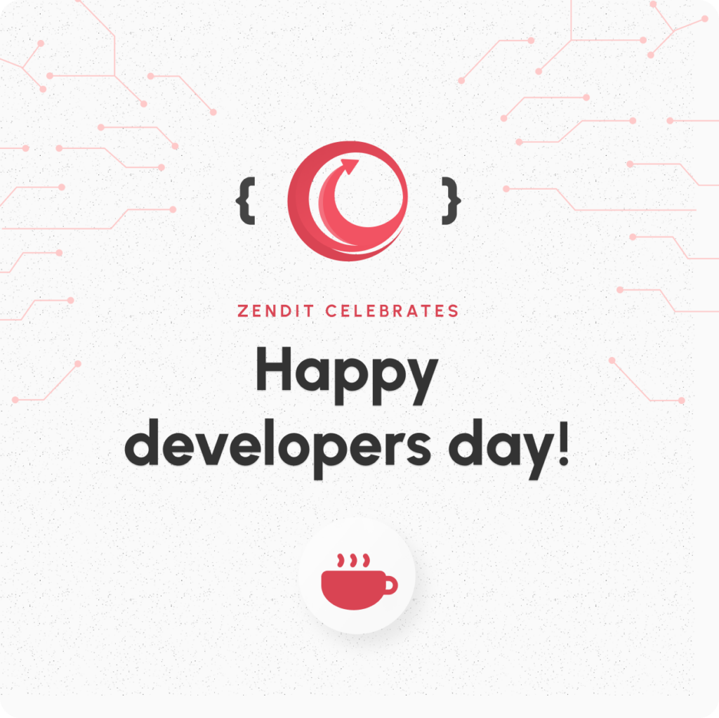
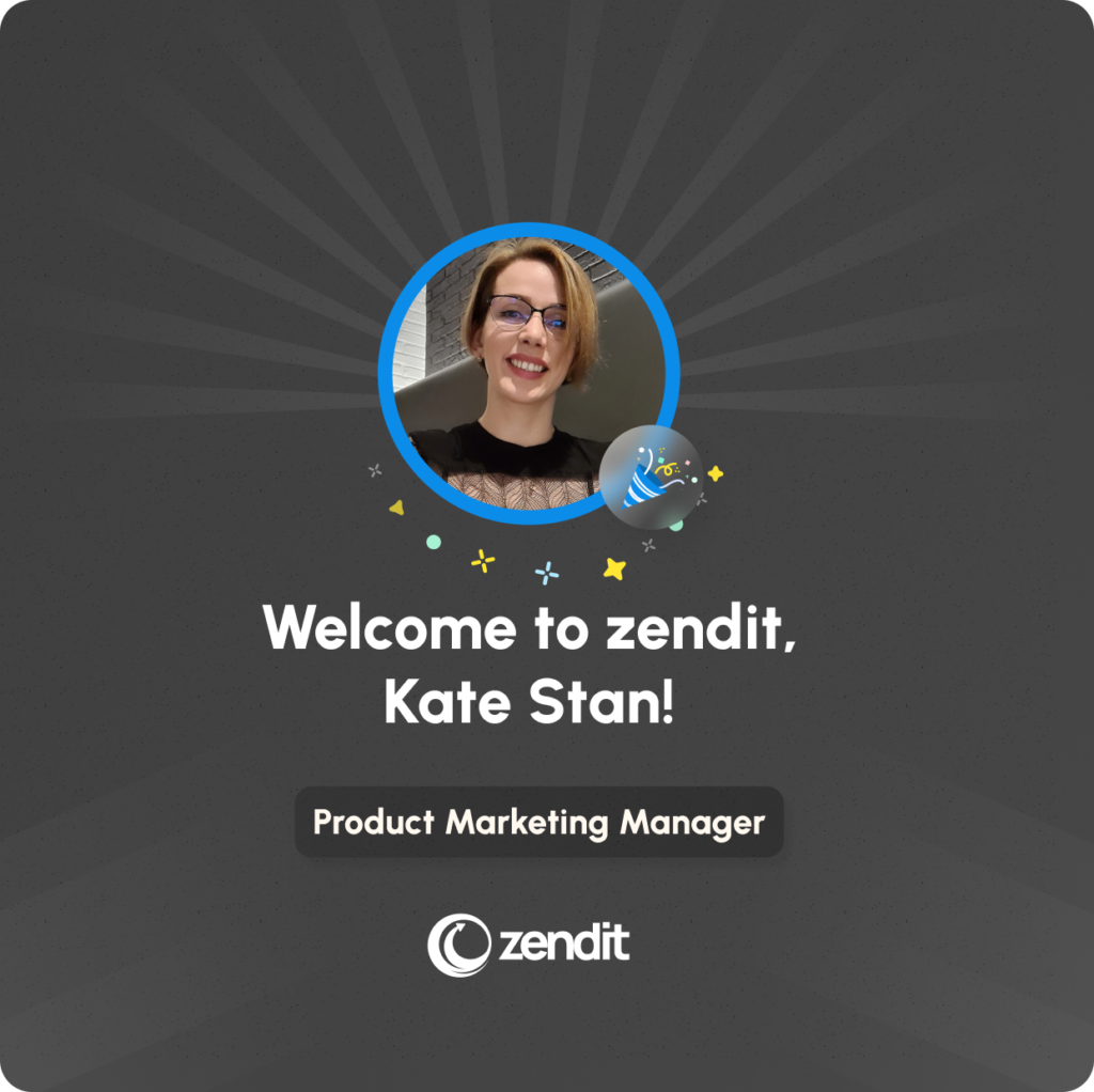
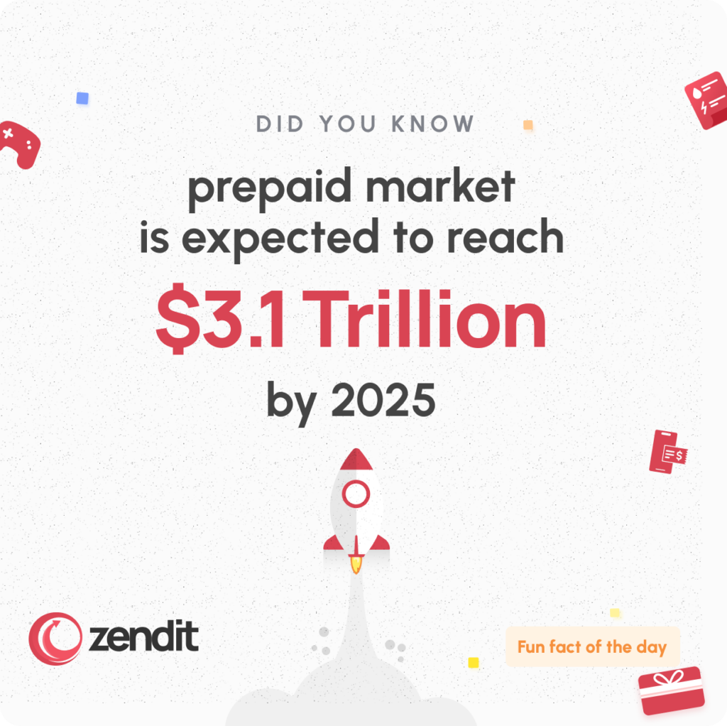
Icons, Illustrations and all materials
We use a custom icon set that we draw ourselves in order to convey the ideas we have in mind.
Primary color is the dominant color used in our icons.
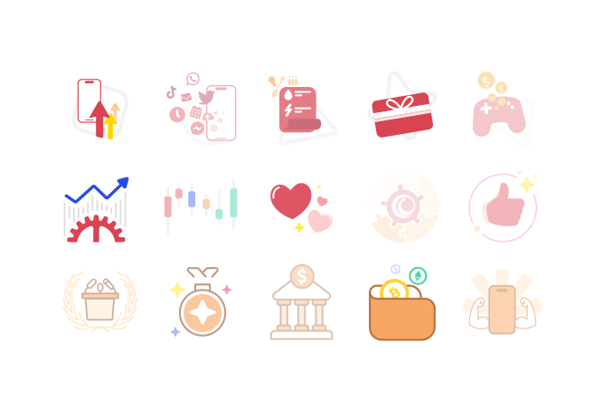

Icons and Illustrations
Our icons and illustrations are hand crafted.
Please try to use the illustrations in your materials.

zendit Google Slides Template
For presentations.
Stick to this presentation template and it has variations inside.

zendit materials in Gdrive
Everything related to our product is laid here.
From marketing to print materials are all collected here, make sure you have access.
Ps. you either need to ask @don.kutbay in slack for access, or have an idt email address.