
Icons, shiny icons and illustrations
Let’s start with the most important heads up so everyone can see this all the way at the top.
Neither blurs nor shadows won’t appear during the flutter screen rendering.
Shadows will be ignored, and even worse, your blurred layers will be reverted to non-blue state. In order to work around that issue, create fake shadows with gradients.
There’s a github issue opened in 2020 and they haven’t fixed it yet. Check the github issue here
UI Icons
These icons are for your small interactions. They’re there to support the UI for the users that are visual.
🚨 Try to use self-explanatory icons in your UIs.
If you want to have a single icon with no text, make sure it’s an established icon (like chevrons, play/pause) otherwise you’ll confuse your users.
General rule of thumb is to have [icon+text] combination.
Shiny (layered) Icons
These icons are for you to express yourself as an artist in the smallest form to your users.
This is the style we internally call “neo minimalist glow” and here’s the figma for explanation.
Things to keep in mind: dark mode and light mode, we want these to work in both modes out of the box, no color changing, as is.
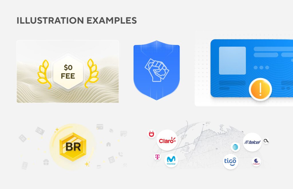
Illustrations
This is where you let go of your creativity loose : )
These are representations of what you’re trying to say in text. If your illustration is not related to your text then obviously it’ll confuse people.
If you’re looking for a custom illustration, please reach out to @yana.hancharova in slack, she’s our product graphic designer.
Heads up for all SVG works
There are some set of rules to keep your SVG assets clean and easier to maintain.
- Do not put images inside of your SVGs
- Do not put shadows, or blur effects in your SVGs (if you’re working with flutter)
- Make sure your SVG doesn’t have too many dots, lines, otherwise it’ll be bloated.